JournalHotel & travel websites
Boutique hotel website design: the complete guide
What a boutique hotel website needs so guests book direct: the opening, photos, booking, rooms, languages and speed, part by part.

A boutique hotel website has one job: to make people arriving from Instagram, Google or Booking feel the place and book directly with you. That takes seven things done well: the guest’s language, an opening that shows the experience in seconds, dates in plain sight, rooms with real photos, how to get there, genuine reviews and a book button always within reach. Everything else is decoration.
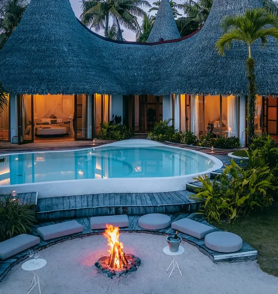
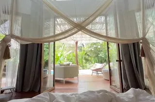 Pool villa2 guests
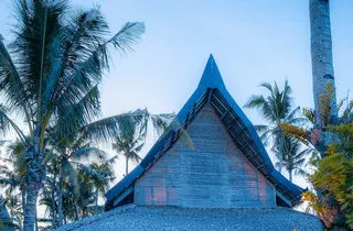 Beach villa4 guests
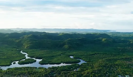 Airport transfer
Anatomy of a hotel website
Language
At the top, in plain sight. Each language has its own address, so Google shows the right version in each country and nobody has to hunt for the switch.
Opening
Five seconds to say where you are, what it’s like and why this place. Your own photo or a short clip, and a line that says what the place is, not “welcome”.
Dates
Arrival, departure and guests, from the start. People who have already decided shouldn’t have to look for how to book.
Rooms
Real photos of each one, how many people it sleeps and what makes it different. It’s the page people compare most before booking.
Getting here
Airport, transfers and what’s nearby. It’s the most common question by message and one of the most searched on Google.
Reviews
A few, real, and close to the booking button. What other guests say convinces more than anything the hotel says about itself.
Book button
Always within reach on the phone and in the site’s style. If the booking continues on another site, the jump should be barely noticeable.
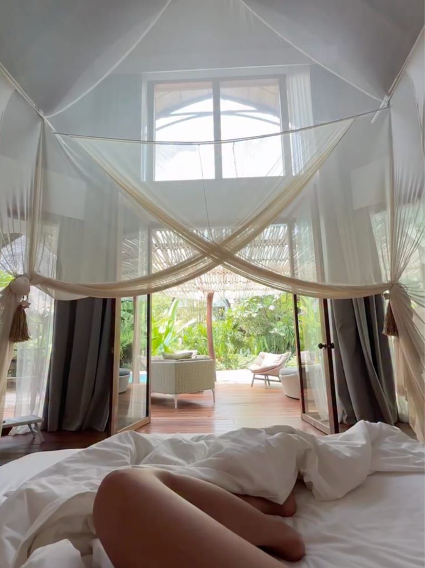
The photos are mine, from my work for Nay Palad Hideaway.
Why a boutique hotel needs a different website
A boutique hotel doesn’t compete on price or room count: it competes on character. The architecture, the people, the food, the setting. A chain’s website can be a date picker; a small hotel’s website has to feel like the place, because that’s the only thing that sets it apart in a list of results.
I film and run social media for Nay Palad Hideaway, a small resort in Siargao, in the Philippines, and I see it every week: what makes someone write to book isn’t the list of amenities, it’s a specific scene. Breakfast at the villa, the boat through the mangroves, the late light on the pool. The website has to be built around those scenes.
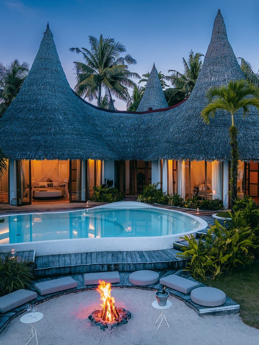
The opening: the place in five seconds
People decide within seconds whether to keep going. What they see before scrolling has to answer three questions: where am I, what is it like and how do I book.
- An image that tells the experience. A photo or a short, silent clip made for the hotel. Stock photos give themselves away instantly.
- A line that says what the place is. Not “Welcome”: “Ten rooms in a village house facing the mountains” says far more in the same space.
- The book button. Visible from the first moment, on phones too.
If you use video, keep it short and light. In Photos and video for a hotel website I explain how I prepare footage so it doesn’t slow the page down.
Booking in one tap
Almost every hotel uses an external booking engine connected to its property management system. That’s fine: there’s no need to reinvent it. What gets designed is the path to it.
- Dates and guests from the home page. People who have already decided fill in their dates and jump straight to availability.
- A fixed button on phones. Always in the same place, never covering the content.
- The same style to the end. If the booking engine opens in a different typeface and colours, it feels like being sent to another site. Most engines let you match colours and logo: it’s worth doing.
- A reason to book here. A perk only direct guests get (breakfast, late checkout, the transfer) gives people a reason not to go back to the online travel agency.
Rooms: what a guest would ask
The rooms page is the most compared one before booking. Each room needs real photos (the bed, the bathroom, the view from inside), how many people it sleeps, its size, what’s included and what makes it different from the others. If someone has to message to ask whether two children fit, information is missing.
Getting there and things to do
The nearest airport, transfers, travel time and what’s around. It’s the most common question by message and one of the most searched things before booking. A good “Getting here” page saves the team emails and brings in visitors who don’t know the hotel yet.
Genuine reviews
A few real reviews, with name and date, close to the book button. Linking to where they are published beats copying loose quotes: trust comes from being able to check.
Languages
Guests need to read the site in their language, and each language needs its own address (for example /en/ and /es/) so Google shows the right version in each country. Translating with a person, or at least reviewing what a machine translates, shows: nobody books calmly on a site that sounds off.
Speed: half of the design
People looking for a hotel on their phone don’t wait. Every second of loading costs visitors before they see a single photo; I go through the numbers in Why a slow website costs you bookings. Images sized for each screen, short clips that only load when they appear and no code that isn’t used.
Your team can edit it
Seasons change, menus too, and offers last weeks. If every change goes through the designer, the site goes stale. That’s why the websites I build come with an editor shaped around each hotel’s content: the team changes a photo, an offer or a text in both languages without touching the design.
What to leave out
- Pop-ups on arrival. They cover what the guest came to see.
- Self-advancing sliders. Hardly anyone reaches the third image.
- Autoplay music. Browsers block it, and whoever hears it closes the tab.
- Chat widgets over the book button. If you need chat, keep it off what matters.
In short
A boutique hotel website works when it feels like the place and booking is easy: the guest’s language, an opening with your own images, dates in plain sight, well-explained rooms, how to get there, genuine reviews and a book button always within reach. All of it fast on a phone.
If you’re thinking about redoing your hotel’s website, tell me about the project and I’ll reply within one working day.
Projects in this entry
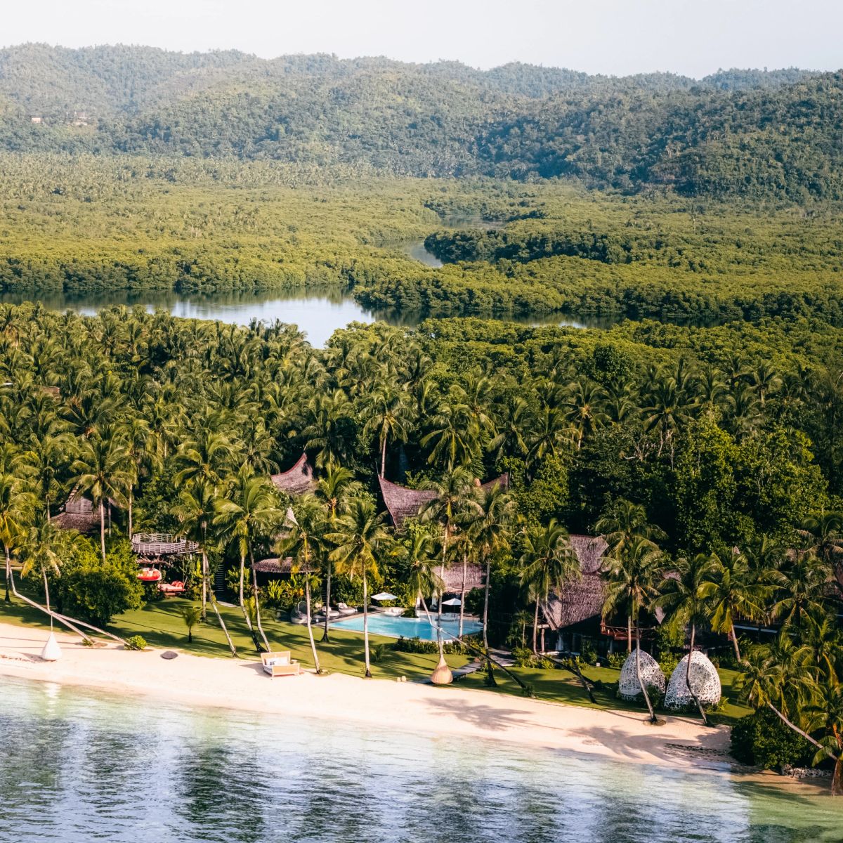
Nay Palad Hideaway
A month on location for a barefoot-luxury resort in Siargao: the film, the photography and the content that drives its social channels.
- +90K followers
- 300K+ monthly reach
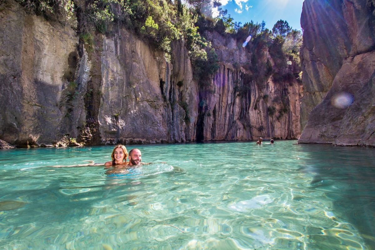
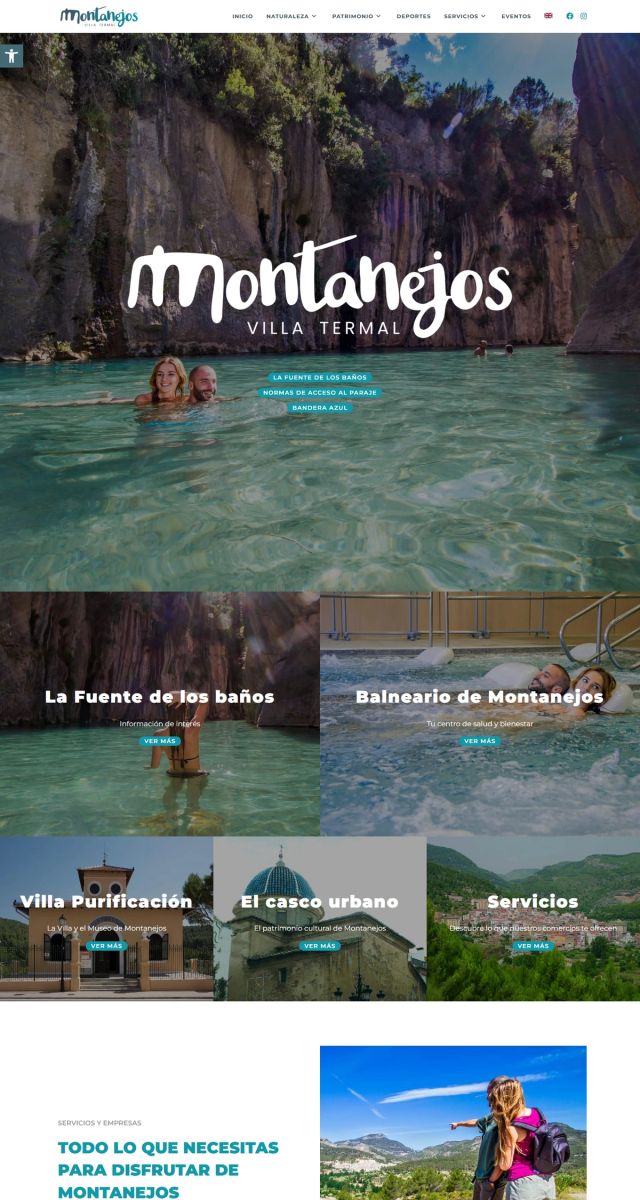
Visit Montanejos
Tourism website for a spa village in the mountains of Castellón, in several languages.
- Multilingual
Keep reading
- Website background video: how to use it without slowing the site downA hero video can weigh more than the rest of the site. How I prepare it to stay light, load fast and not get in the way, with real numbers from a shot of mine.
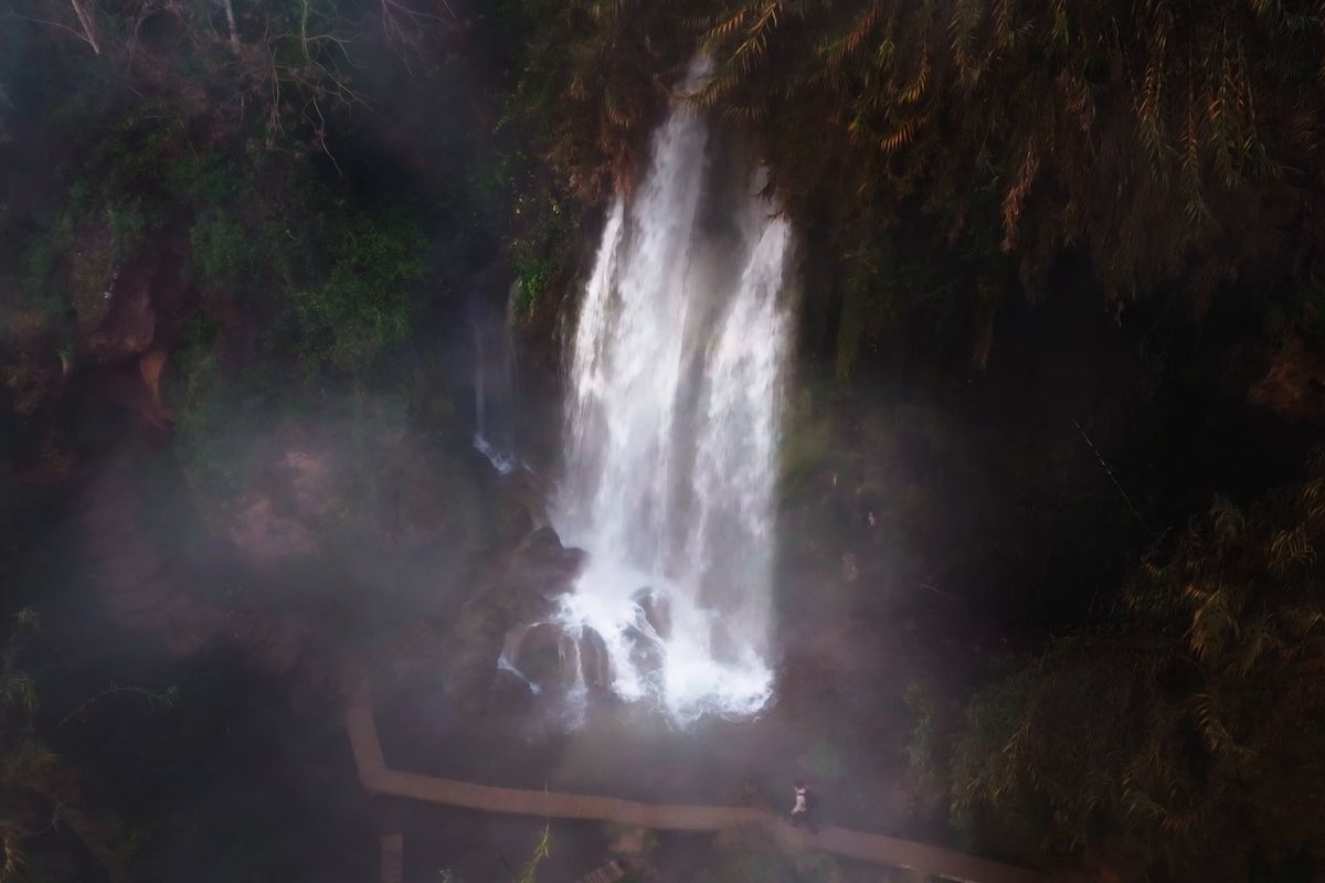
- Direct bookings: how your hotel website can depend less on OTAsEvery Booking.com or Expedia reservation costs 15 to 20% in commission. What your website needs so more guests book directly with you.
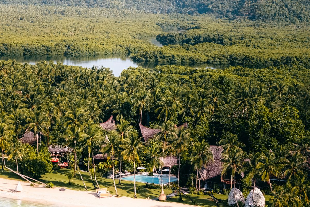
- Photos and video for a hotel website: what you need and how to plan the shootThe shots a hotel website needs, how to organise the shoot to get them and what to ask for on delivery so they last for years.
